SentimenTrader Charts for the week ending October 22nd...
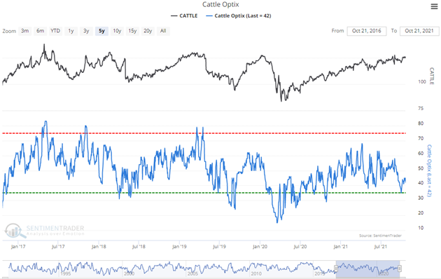
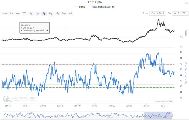
The theory behind the "Bullish/Bearish Consensus" indicator is when the public reaches a consensus, they are usually wrong:
-
They get too bullish after prices have risen and too bearish after they have already fallen. Because of this tendency, there are often extremes in opinion right before major changes in trend.
-
When the public reaches a bullish extreme, i.e., a great majority thinks prices will keep rising, then prices often decline instead. And when they become too bearish, then prices tend to rise.
So when Public Opinion moves above the red dotted line in the chart, it means that compared to other readings over the past year, you're seeing excessive optimism. You also want to look at the absolute level of Opinion, too - if it's at 90%, then there's no question we're seeing an historic level of bullish opinion. Watch for readings above 80% (or especially 90%) to spot those dangerous times when the public is overly enthusiastic about a commodity.
Conversely, when Public Opinion moves below the green dotted line, then the public is excessively pessimistic about the commodity's prospects for further gains compared to their opinion over the past year. Looking for absolute readings under 20% (or especially 10%) often indicates an upturn in the market.